Place your image within Power point
Create at least four slides with the image inside.
Annotate the final design with comments linked to the statement of intent where you will tackle the four aspects of the OCR Media Framework.
For each page discuss how the advert conforms to
· [media language: how the media through their forms, codes, conventions and techniques communicate meanings]
· [media representations: how the media portray events, issues, individuals and social groups]
· [media industries: how the media industries’ processes of production, distribution and circulation affect media forms and platforms]
· media audiences: how media forms target, reach and address audiences, how audiences interpret and respond to them and how members of audiences become producers themselves.
refer to
to help you to communicate how your advertisement meets the needs of a target audience.
 .
.


My first advert shows a woman sitting down on a stone beach, looking into the camera. This is a direct mode of address with the audience with connects the audience to the advert. My second advert shows a male and female in active clothing high-fiving on some grass in front of the sea. This advert has an indirect mode of address as the models are looking at each other and laughing. This helps the audience form a relationship between the two models, and helps the audience believe they could get this relationship for themselves if they use my product.
My adverts use the emotional appeal of "plain folks" to also connect with the audience. Both of these factors help the audience to connect to the advert on a personal and emotional level, which can help to convince the audience to buy the product. My adverts also use the logical appeal of "bandwagons" and the emotional appeal of "catchy slogans" to sell my product. This is because my tagline is "the wave of a new generation" this can make the audience think everyone is using my product and they should too, it is also catchy and easy to remember so it would stick in the mind of my audience.
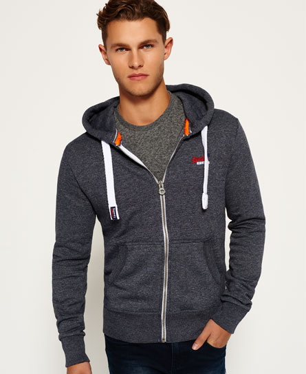
These adverts portray the younger generation as fashionable, active and goal oriented. All of the clothes the models are wearing match and don't clash, making the models look cool and modern and also active as some of my models are wearing sporty clothing. In the first advert there is just one female which could put of males from buying the product but she has some boyish accessories (hat and bag) which could go towards a more gender-neutral audience, but in all of the other adverts there is both a male and female model which helps to market it towards a gender-neutral audience.


 I want one of my pictures to be a photo of people high-fiving to show active youthful people it also might help people think that my product helps achieve a goal.


 (southsea beach)


